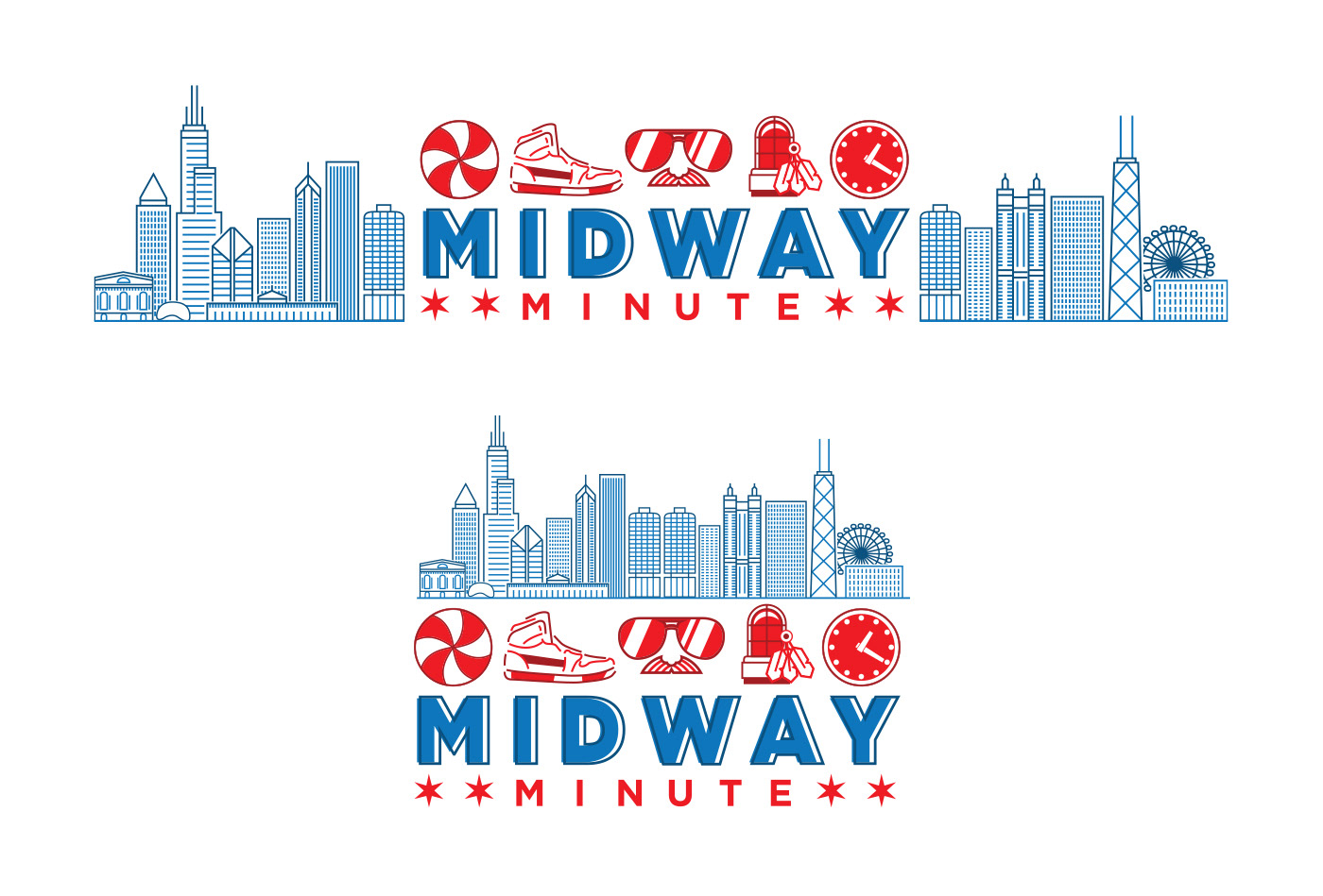
Client: Midway Minute
Project: Brand Identity
Overview: in 2019 my cousin reached out to me as he was starting to develop a Chicago themed Email Newsletter. His goal was to catch Chicago sports fans up in a quick way on what their favorite teams have been up to. In 2020, the Midway Minute was born. The theme gained inspiration from the Chicago flag, Chicago's teams, and loose inspiration from some of the city's newspapers.
Each Chicago team is represented in its own red icon that was to mimic the feel of a "Chicago Star." From there the icons are used as a header for each section when that team is being written about. The mast was inspired by the hand drawn skyline that used to be featured on the mast of the Chicago Tribune. The word Midway is purposely offset as a nod to printing plates.
"Good Morning, Frents!" has quickly become a catch phrase for the newsletter. For those not from the area, "Frents," in the Chicago accent is the word for friends. Since this is a morning newsletter, it made sense to get coffee mugs designed with the catch phrase using design cues from the hit '90s sitcom, Friends.